-SHOOTING ASSIGNMENTS-
-Canada 150-
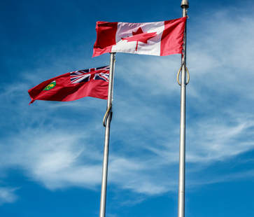
- For editing, I adjusted the cool and warm tones, added more clarity, cropped the photo on all 4 sides, increased the saturation and contrast colors to allow for the blue in the sky to pop. This photo represents Canada as a nation with the Canadian flag and looking at it makes me think about how lucky I am to live in a country such as Canada. It blows my mind that Canada has been a country for 150 years now.
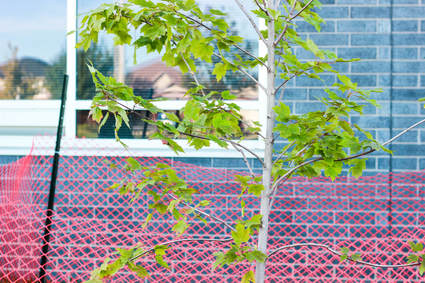
Since the time capsule was covered with a wooden board and an orange fence, I decided to take it upon myself to focus on the beautiful tree in front of it instead. This shallow depth of field image of the tree is more aesthetically pleasing than the fence or board. For the editing portion, I increased the contrast and saturation to really get the color of the tree and background colors vibrant, adjusted the clarity, balanced out the cool and warm as well as the black&white tones, and cropped the image to make it proportional.
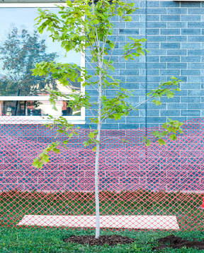
This image connects to the previous in a sense. I focused on the same beautiful tree, but this time I zoomed out and go the whole time capsule in the picture. I worked with what I had and tried my best to make a great image out of a boring scene. For the editing part, I again increased saturation and contrast, cropped both sides, increased the clarity and sharpness slightly, increased the cool tones and decreased the warm tones (slightly) and adjusted the white&black tones to complete this picture.
-THANKSGIVING-
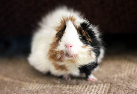
I have thankful for my guinea pig Autumn. Not only is she the sweetest little girl, but also a big part of my life. I am so very thankful that she survived her abdominal exploratory surgery as it is a very risky surgery for a small animal like her.I decided to take this picture in shallow depth of field because I wanted Autumn to be the main subject of focus. As for the editing aspect, I simply made some black&white corrections, cropped the photo a little bit on the sides, added some extra clarity for added detail, and fixed the cool and warm tones. There wasn't too much to do for editing as I became content with the final product very quickly.
I am so very thankful for my house, having shelter and a place to go every single day. I am lucky to be living in a nice neighbourhood in a big house and it makes me think of all the less fortunate people in this world who sleep at bus stations and bed for money on the streets. I learn at this time to never take anything for granted. For the editing aspect of this photo, I used lens correction and tilted the photo to adjust the proportions, cropped the bottom and 2 sides, increased clarity once again for added detail, adjusted warm and cool tones and the black&white tones.
Another thing that I am thankful for is my grandparents who I love very much and mean the world to me. My grandpa in specific had been diagnosed with skin cancer on his face. He then had to undergo a procedure to remove the cancer and it was a success. His skin cancer diagnosis had no metastasized and is expected to have a full recovery. As for editing, I cropped the photo, adjusted the sharpness and clarity, cool and warm tones, increased the white tones and decreased the black tones (both slightly), and the photo is in shallow depth of field to make my grandparents the main focus.
-SHADOWS-
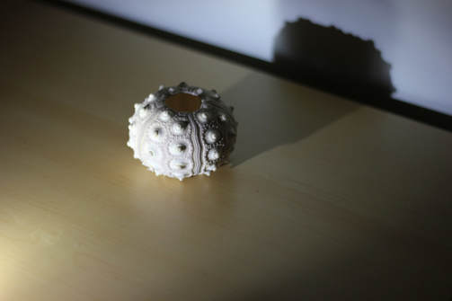
This is an image of a shell from Hawaii and I chose this shell because I thought it had an interesting shape to it and would create an appealing shadow. In terms of editing, I started by cropping the photo on each side to ensure that it is proportional. I increased the clarity, vibrance, and saturation. I adjusted the black and white tones, decreased the shadows all the way, decreased the highlights, I also adjusted the temperature and tint and decreased the exposure which allowed for a more in depth and darker image.
This is an image of a fake plant and it has very detailed thorns which allowed for an interesting shadow. For editing, I cropped all 4 sides, increased the exposure, decreased the highlights, decreased the shadows, significantly decreased the whites as I increased the black tones. I also adjusted the clarity, vibrance, and saturation until was satisfied with the results. I finished the editing by increasing the temperature and decreasing the tint of the image.
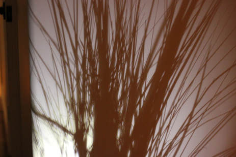
This is an image of a fake plant as well, it has a more long and slim appearance compared to the last image. I found the shadow that it created on the wall to be very complex with many strands and I liked that about it. For the editing aspect of this image, I cropped the left side to make it equal to the right, increased the temperature and tint slightly, decreased the exposure, increased the contrast, vibrance and saturation, as well as increasing the clarity all the way to ensure the final product would not come out blurry. Finally, I increased the black and white tones.
-AUTUMN-
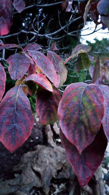
This is an image of some leaves of a tree in my backyard. The leaves on this tree in particular does not turn a variety of browns and fall off, rather it stays the same throughout time. I found the style, shape, array of colours, and the placement of these leaves incredibly interesting opposed to other trees in my backyard. For the editing aspect of this photo, I have not cropped it as the image was already proportional all all sides to begin with. I decreased the temperature, increased the tint, increased the exposure and contrast to ensure that the pink of the leaves would stand out, I decreased the highlights and shadows, increased the whites and decreased the blacks, I adjusted the clarity, vibrance, and saturation for an overall bright, colourful, and playful image.
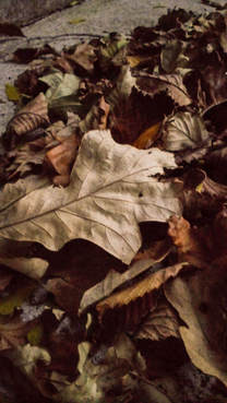
This is a photo I took of a pile of dead leaves that had recently fell off of a tree in my backyard. It defines the whole Autumn aspect of this assignment because this is one of the main things you think about when you think of all things fall. To edit this photo, I started off by increasing the temperature and tint, I increased the exposure and contrast, I decreased the shadows, highlights, and whites, I decreased the blacks, clarity, and vibrance, and finally I decreased the saturation. This photo didn't have to be cropped as everything was proportional for my liking.
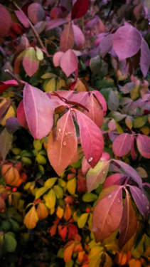
This is an image of a tree in my front yard called "burning bush" and I thought the way it had greens, yellows, reds, and pinks all blended to create flaming look. To me, this photo makes me think about a warm Autumn day which are vibes I get from the colour scheme. For editing, I increased the temperature and tint, decreased the exposure, increased the contrast for extra vibrancy of the flaming leaves, I decreased the blacks and shadows, increased the whites and kept the highlights the same, finally I increased the clarity and saturation to finish off my photo editing.
-HALLOWEEN-
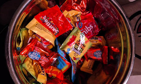
This is a classic Halloween picture as the first thing people tend to think about during the Halloween days. In terms of editing, I kept it very simple. I started by cropping and centering the image, adjusted temperature and tint as well as grey tones, I increased the shadows and decreased the highlights, bumped up the saturation and vibrancy to make all the wrapper colors pop and stand out. For the physical aspect, I did set up the candy in the bowl in a balanced and aesthetically pleasing way.
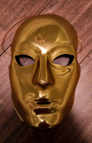
I took a picture of a mask simply because Halloween is part of dressing up and using masks as a disguise. I thought this mask in particular was interesting due to the fact of the simplicity in color and shape. This happens to be a very old mask I happened to find in my Halloween chest. For the editing aspect of this photo, I started off by cropping the image, increasing the temperature slightly, keeping the contrast and exposure leveled at 0, decreased highlights, shadows, whites and blacks since the mask is already has a highly shiny and reflective surface. To finish off I increased clarity slightly, and decreased the vibrancy and saturation.
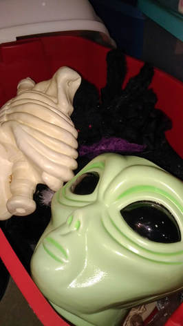
This is a picture I took of my Halloween chest I have in my basement. For obvious reasons, this image perfectly represents Halloween with the dressing up and house decorating aspects of the holiday. In terms of editing, I started off by cropping out anything unnecessary for the background to get the main focus of my photo. I adjusted the whites and backs and turned up the brightness as I took the photo under darker than intended conditions. I increased the highlights and shadows, as well as increased the saturation, vibrance, and clarity to finish it off.
-SHOES-
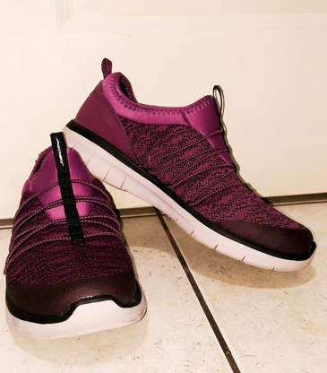
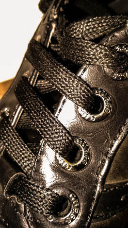
I started off my shoe s]photoshoot with these purple and pink coloured running shoes from my mom. I chose these in particular because there is a lot of structure and detail to them. I specifically like how the sole of the shoe has a glow-like appearance to it. As for editing of this image, there wasn't too much to go over. I used flash when tasking the photo because I wanted them to have a bit of glow to them. I used whites and blacks balancing to get the perfect shading and highlights. And adjusted the temperature, shadows, brightness, and the exposure to really make the beautiful colours bind together and pop.
These are another great pair of running shoes that caught my eye. As you may notice, I decided to use my treadmill as a background for the running shoes which I thought was very creative n my part. I messed around with the exposure and shadows to create that perfect balance of depth and glow to the whites and reflections as well as the blacks and darks. The temperature and tint were increased just for the purpose of showcasing the bright, vibrant colours that occur within the shoe. To finish it off, I increased the vibrancy and contrast for a little extra something to the photo.
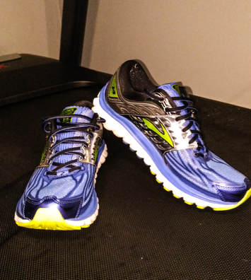
This is by far one of the most detailed and best photo I have taken throughout the semester. I am very happy with how it turned out and am impressed with myself. To edit this photo, I increased the exposure, contrast, and clarity. I decreased the shadows, whites and blacks, and the highlights. The rest I was content with and I kept it the same. There was not much in terms of the editing aspect of this photo, but it is one of my best. I made sure to get good lighting, close up with lots of detail, and angle it in a way that makes it look the best of the best compared to any other shoe.
-ANIMALS-
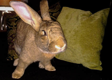
This first photo is a picture I captured of my bunny, Jax. It was difficult to get him to stay as he is a very energetic bunny and doesn't like it be in one spot too long. I got very lucky with this photo as he was already mid-step when I was taking it, but I increased my shutter speed in hopes of getting a great image very quickly which worked for me in this case. I decreased the highlights all the way since they were very extreme since I ended up using flash. I also used the red eye correction tool on his eye to adjust the red tones. I played with the clarity, whites and blacks, saturation, vibrancy, and the temperature tools to my liking to get this as a final product.
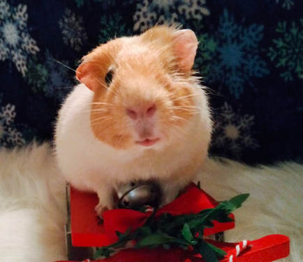
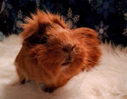
This is a picture I took of my guinea pig Sage. I made a Christmas theme for this photo. I set up the photo with a fluffy white mat to look like snow, a blue snowflake blanket background and she is sitting on a sled. She had a lot of fun with this as she is very good with photos and socialization with others. There wasn't too much I did in terms of editing. I cropped, increased clarity of extra details in this, increased the saturation to enhance the orange in her fur and the other colors in the background, and I finally adjusted the blacks and whites, shadows, temperature, tint , and the grey tones.
This is a picture of my guinea pig Willow. I tried to capture the details in her fur and her face with a closer up focus of her. I cropped the image to create an even higher focal point on her. By increasing the temperature, vibrancy, shadows, highlights, saturation, and tint of this photo, I made the orange in her fur coat stand out, the background look increasingly enhanced, and the whole aspect of the photo look overall enhanced and positively changed to a more appealing image to the eye.
