-MY MANS OZZY-
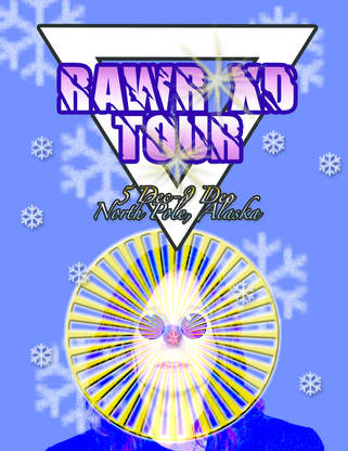
This is a poster I made which introduces a tour that Ozzy Osborne is going on which is obviously a fake poster. I went for a Christmas or winter wonderland theme as the tour date is in December and it seems to be located in the North Pole, and Alaska. I made sure that the photo had corresponding colors that blend well together such as blues, yellows and purples which are 3 main colors I stuck to. I changed the blend mode on Ozzy hence why he has blue hair and a Rudolf nose. I added various sizes and patterns of snowflakes dispersed throughput the background, placed an upside down white triangle that has no meaning besides the appearance and extra design, as well as a golden centerpiece placed on top of his face and added an outer glow to it. As for the title, I came up with this name just to make it more extra and overall, obnoxious.
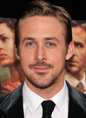
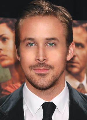
-RYAN G EDIT- SHOE LOOKIN TO GOOD LOOKIN ;)
|
BEFORE
|
AFTER
|
There was a fairly long process to turn Ryan from a mouldy shoe to an Abercrombie model. It wasn't necessarily the easiest thing to do, but in the end I am very impressed with the results. A couple of MAJOR adjustments were made to Ryan. His eyes were fixed change of colour and shape to make them exactly alike, his skin was smoothed out and removed of any impurities such as discolouration, wrinkles, pimples etc. I added contour and highlight to finish off his new appearance to add a simple touch of bronze and dewiness to the skin. His eyebrows were originally really bushy and overall out of place, so I had to erase some of the hairs with the eraser brush. Overall, the edited in photoshop photo looks 100x better than the original photo and he is indeed a new man.
-SHOE PRINT AD RESEARCH ASSIGNMENT-
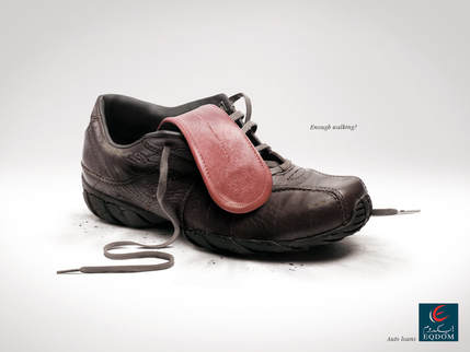
- I chose this shoe advertisement because I thought it was very interesting in how the designer made the sole of the shoe into a tongue. They replicated the tongue in the shoe as if it were a panting, tired person after a long walk. The shoe also looks kind of dry as if it were a dehydrated person which I thought was a very interesting idea on their part. I am using this print ad as an inspiration to use my creative side more and think more outside of the box, unoriginal, and unique not seen before print ad as my very own. Some of the techniques that i'm assuming the designer used for this print ad would be shinning the shoe, making the shoe look as though it is run-down or old, the look of dirt underneath the shoe, adding more creases and lines into the texture and material of the shoe to give an overall appearance of an old, dirty, and tired looking shoe to go along with the slogan "enough walking?"
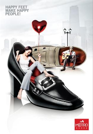
I chose this shoe advertisement because it gives off a very happy, pleasing, uplifting emotion. Both of the people appear to be in a good mood, having fun, while sitting inside of the shoes. The designer really got into touch with their creative side when creating this print ad, not only is it complex in terms of photoshop and editing skills, but as well as very interesting to look at and try to understand some sort of meaning behind it. This ad inspires me in many ways such as making an ad that is personalized as well as complex in a good way that viewers have to stare for a bit to try and wrap their mind around what is going on. I don't want it to be con fusing in a bad way that viewers are just too confused to even bother reading or looking at it. The editing techniques that I think the designer used are that they created couch-sized shoes big enough for a human to sit inside, adding a faded background of a city to give off a busy city vibe, making the shoes appear shiny and imperfection free, making the shoes appear as if they are on a reflective mirror-like surface as the viewers can see the reflection of the shoes on the white background.
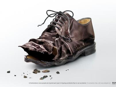
I chose this shoe advertisement because I think it has a very different approach compared a standard shoe ad. The shoe appears to be very damaged and ripped apart, opposed to shiny and perfect looking. I like how the designer was more focused on making the shoe look as broken and damaged as possible more than having the look of a perfect, dent-free shoe. This shoe ad inspires me to not just focused on creating an ad that is typical and having the shoe look stunning, rather consider an ad where I am trying to get the most damaged look to send some sort of a message behind it. In this case, the message was to bring awareness to tripping accidents in Switzerland. A couple of the techniques that the designer was said to use would be making the shoe look as though it was a car in a car accident, having a compressed look in terms of the end of the shoe, pieces of the shoe is breaking off and falling onto the floor of the image.
-SHOE ADVERTISEMENT-
|
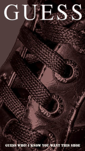
This is an advertisement that I made using a picture I took of one of my shoes. The shoe I took a picture of happened to be from GUESS and I decided to base my ad off of it. I added a grey hue and saturation over top of the shoe and I changed it to overlay to get the effect I was hoping for. I then placed a giant GUESS logo to the top of the ad and I added an inner shadow, outer glow, inner glow, bevel and emboss, and finished it off b y adding a colour and gradient overlay. I did the same process to the text on the bottom as well. I was going for a very simple and semi formal advertisement. I really like how the final product turned out and it turned out the same I was planning in my head.
|
The left photo is the original, edited shoe and the right side is the edited shoe into its own shoe advertisement.
-MULTI IMAGE ANIMAL PORTRAIT-
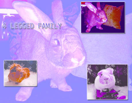
- This is a multi image animal portrait I made introducing a few of my pets. The base of the photo is my flemish giant rabbit, Jax. I used a purple background colour and changed the setting to vivid light to achieve the hazy purple hue. The 3 small images include another image of my rabbit, my guinea pig Willow, and my other guinea pig Sage. I added a drop shadow, outer highlights to the outline of the images. I then put different shades (dark and light) of purple on each one of them and changed the settings on them so that I could achieve a variety of hues and saturations, To finish off this portrait , I added text with drop shadow and outer and inner glow added to it. There is a trippy kind of appeal to this, unoriginal and not bland which is what I like about this. I wasn't trying to achieve something boring, I was going all out and trying to make this obnoxious yet appealing.
